


Southern Alberta Land Trust Society
SALTS came to Studio 3 with an existing logo, but needed more clarity around how their brand showed up. The goal wasn’t to redesign, it was to build a system that could support their growth and bring consistency across materials.
While the foundation was there, decisions were being made case by case. As their communications expanded, so did the need for alignment.
We began with strategy, taking time to understand who they are, who they speak to, and how they sit within their space. From there, we developed a brand guideline and defined the visual and verbal system around it, including typography, colour palette, tagline, and direction for photography and social.
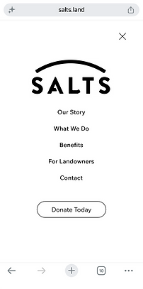
With that in place, we expanded the brand across key touchpoints, including their annual report, fundraising and informational materials, brochures, presentation folder, social media direction, and a redesigned website. Studio 3 worked closely with their developer to bring the new site to life.
What started as a brand without clear structure became a cohesive system. SALTS now has a framework they can rely on, allowing the brand to grow with clarity and consistency.
BRAND STORY
WORK INCLUDES
Brand Strategy
Brand Guideline Development
Typography Selection
Colour Palette Development
Tagline Development
Photography Direction
Social Media Direction
Website Design
Developer Collaboration
Annual Report
Fundraising Documents
Informational Packages
Presentation Folder
Brochures
WEBSITE HOMEPAGE




BRANDED TAGLINE
COLOUR PALETTE
BLACK
WARM WHITE
SADDLE BROWN
SKY BLUE
PRAIRIE SOIL
SAGE-GREEN
TYPOGRAPHY


SOCIAL MEDIA PROFILE

SOCIAL MEDIA DIRECTION


ANNUAL REPORT


BROCHURE

Sheera guided us through a thoughtful brand strategy process that helped us clarify our existing brand identity, messaging, and positioning. The process gave us the confidence and direction we needed to make consistent decisions across all our communications.
Since implementing the new brand strategy, updating and creating marketing materials has become much faster and more efficient. We now have a clear foundation to guide everything we produce, ensuring our messaging is consistent, authentic, and aligned.
I’m extremely grateful for Sheera’s guidance and support and would recommend her to any organization looking to strengthen their brand and communicate with greater clarity and confidence.

SEE MORE WORK
Something
Personalized
Something Personalized is a boutique in Toronto, specializing in unique and timeless personalized gifts for babies, children and adults.

FE Ingredients
FE has been in business since 1984, but were due for an updated look that reflected their business.

Ryan Wood Real Estate
Ryan Wood Real Estate is a client-centric full-service real estate agency, lifestyle and concierge based in Toronto.

Becked Goods
With a new midtown Toronto shop, and a growing business, Becked Goods approached Studio 3 to develop a professional, consistent identity.